
Almost 30% of all community or website visitors prefer using a search box when looking for any product or related information. Having a search solution is important, as it has big influence on what users learn, where they go, and what they believe. And equally important is making sure that user experience with the search box is apt. It is imperative to be mindful of the following while making Design choices.
Placement of the search box
The position of the search box is a crucial factor that decides its adoption success, which later defines how many cases it is helping deflect. Making users search for the search box is not good for customer experience.
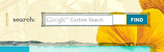
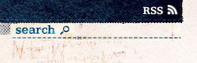
The usual and most productive search box position is the top right or top center of the homepage, which is simply perfect because it has to be easy to spot and access. Here’s an example from Optimizely’s Optiverse community.
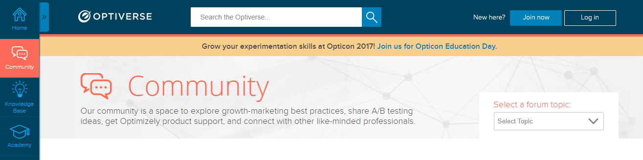 Having the search box right where expected encourages users to search for the information they’re looking for before they decide to create a new ticket and reach out to the support team.
Design of the search box
A search box, before anything, is an input field along with a submit button. This makes the design of the search box an inevitable factor for its success. It is always likely for you to underestimate the power of this factor, but it may go wrong at any time, be it in terms of the text size its input field allows for or the size of input field itself.
To begin with, let your search box be very simple, yet very effective. It is rightly said, “Simplicity is the ultimate sophistication”. Here we all can learn from Google. The search box used by Google is the simplest of all, and yet it is powerful enough to outpace any other search engine. Make sure you keep yours simple and easy-to-use. Having advanced search box options makes it even better. It allows your community users to be specific about their query or the information they are looking for and get more targeted results.
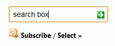
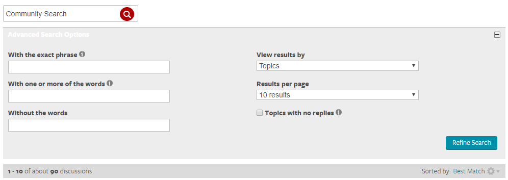 Tip: Keep your search box as a simple, wide box, since a button without a text field or linked text is hardly likely to be spotted by users.
Trying to be too creative can be a disastrous endeavour when it comes to designing a search box. Designers generally tend to commit certain mistakes in search box design, which may comprise:
- Hidden or hardly visible search box
- Too small a submit button
- Giving a creative name to submit button
- Including more than one submit button
- Too short an input field
- Color scheme matching with community’s
- Too complex a design –
- Designing other elements similar to search box
Here is a quick view of what you must ensure when designing your search box.
- Emphasizing the search field – Make sure you have a complete open-text field. Google already had the most used search box, and still, in its new avatar, it made the search box more prominent. In addition, the search suggestion size was also increased to ensure that the suggestions are clearer and easily readable. The size of the search box allows users to accommodate long searches – technical questions, for instance. So, ask yourself, “Are we encouraging our users to search?” before you finalize the search box for your community.
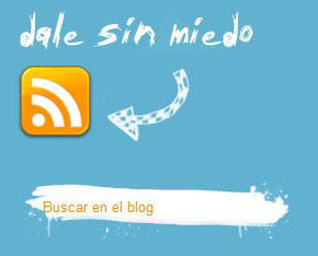
- Using a magnifying glass icon – It is self-explanatory with the icon that your community users can look for information here. Icons are a great way to engage with web users.
- Branding of the search button – The button is a subtle suggestion that draws the attention of your community users prompting them to search. One thing to ensure with the search box design is that it must complement the community’s/website’s overall design and comply with your branding guidelines.
- Naming of the submit button – You always have multiple options to name your submit button, but limit your creative bent here. Give it an eloquent name, such as “Search” or “Find”, which gives a clear indication that users need to click here to look for information. “Go” is more of a vague term.
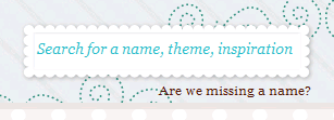
- Having a search box title and a blinking cursor – Although, a box with a submit button and a magnifying glass is self-explanatory that it is a search box, let users know that it actually is. Provide a section title to the box.UXMatters says that users expect an input field label at the upper left of your search interface. Unlike this, characters or symbols such as an arrow (pointing to the right, of course) also work well. Besides, a constantly blinking cursor is highly prompting for users to type in the box.
Search Box Display
Functioning of the search box is as important as its designing. At first, users prefer looking at the first three indexed results only. Similarly, 75% of users consider scrolling only the first search results page and not beyond that. According to Jakob Nielsen, the first page of search results is golden. Therefore, ensure that your search optimizes results in a way that the most relevant ones appear at the top.
Here are a few examples of some of the best community search box designs:
1.Classic

2.Unique

3.Illustrious
4.Rounded

5.Magnifying glass-supported


6.Symbolic

7.Boxy

8.Crafty
9.Experimental

Are you in search of an intelligent search solution? Contact us Now.
Grazitti Interactive’s Search Unify is an AI-based enterprise search solution that securely integrates all your information assets and delivers relevant search results to your community users. Fill out the form to get a free demo of Search Unify or write to us at info@searchunify.com for more details.